Focusing on empathy in website design

Story by Designer/Art Director, Ashleigh Reynolds

The new Tenants Victoria website

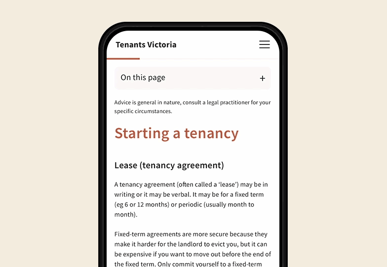
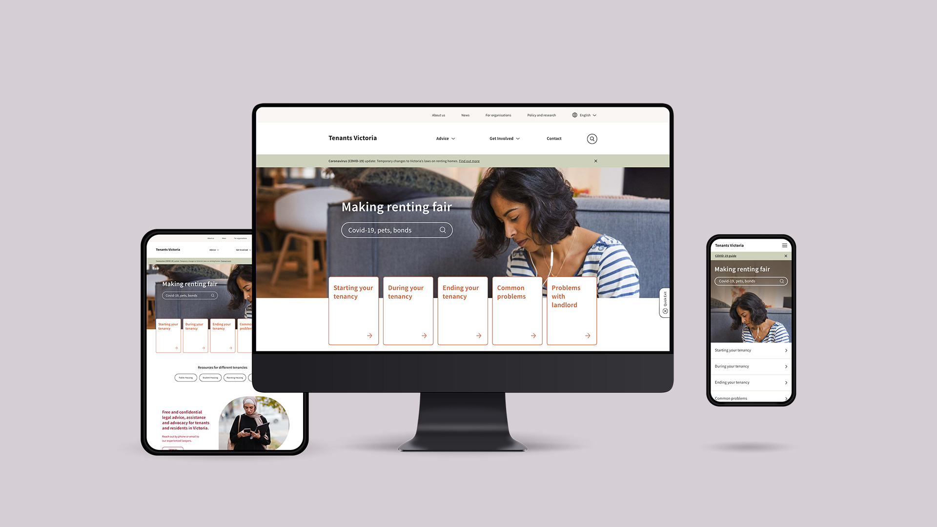
The law is often convoluted and inaccessible to the general population. Tenancy rights in Victoria are no exception. Tenants Victoria represents two million Victorian renters. With a confusing and cluttered website driving users towards an under resourced phone and email service, the existing website wasn’t great for anyone.

One of the most important things to do with the new website project was to understand the user’s needs and put empathy at the centre of the solution. Clear navigation and structure for the 1,000+ pages as well as accessible design and warm art direction were vital.

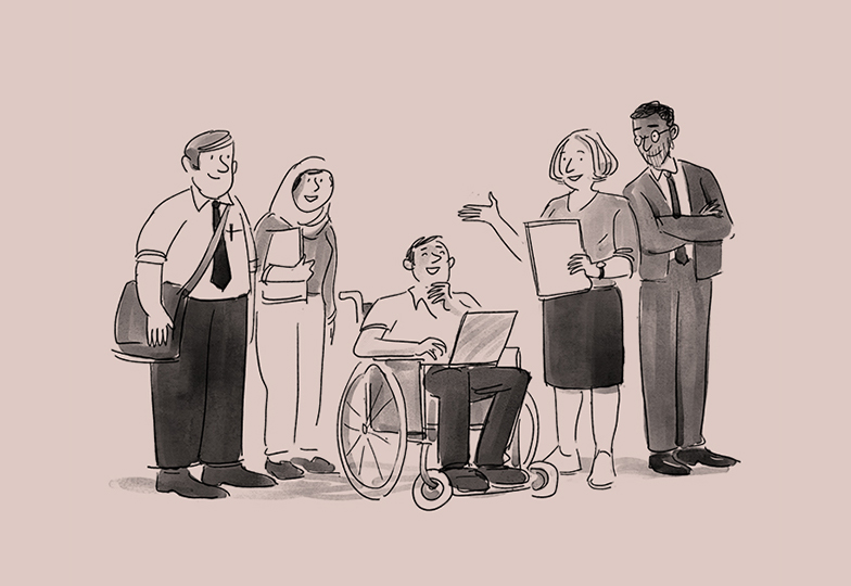
People don’t often seek legal advice unless something has gone awry. To design solutions based in empathy we looked further than the user’s jobs to be done. We took into consideration how the user was feeling when they came to the site and the context for the session. For example, someone who has been served a ‘notice to vacate’ may be in a state of panic and anger. Stepping into the user’s shoes helped create positive and more impactful design thinking and touches throughout.

“Sometimes people call us while they are physically being evicted. Police are at their house. So yeah it’s quite urgent.”

— Tenants Victoria Lawyer

A challenging site navigation, over a thousand pages and few opportunities for quick scans meant people often reached out for help directly from the organisation for even the simplest things. In many cases, they couldn’t get help at all.

This prompted us to run both internal staff and external tenant interviews. From these interviews, we created three user personas.

  1. The DIYer — a user who is happy to do their own research to find relevant information and resources to assist their situation. The nature of the user’s issue usually is non-urgent or non-complex.
  2. The Advice Seeker — a user who can identify the legal issue they’re dealing with, read information about it but still would like to get verbal reassurance from a lawyer.
  3. In person help — a user whose issue is more complex, or they struggle to self-serve, who needs help with a conversation or tailored advice. These users are often those who need representation in court. We identified these users as the highest priority for the email or phone service.

With the three user types in mind moved to prototyping and created a sitemap and wireframes.

With over 1000 English and foreign language pages, bulletproof navigation was incredibly important. We reorganised topics into relevant categories and implemented a strong search function.

The outline to solid hover state on the cards and buttons increases contrast which helps those with limited vision. The increased contrast hover state also encourages users to complete a particular action rather than falling back to the more involved navigation menus. It says “Hey it’s right here — go for it!”

Home navigation card hover

On the text pages we implemented a progress bar in the sticky top navigation to set expectations for the user as some pages are quite long and full of information. To help users navigate these pages the ‘On this page’ sticky navigation anchor links down the page. Typography hierarchy and highlighted sections for users who skim read were also considered.

Text page navigation

It was particularly important for all of us on the project to have Australians represented throughout the site from diverse ethnic and socio-economic backgrounds. We also collaborated with Melbourne based illustrator Jeff the Peff to bring a feeling of warmth and humanity to key pages on the site.

Eighty-four percent of the pages on the site are in a language other than English. We linked each of the 27 different language translations to their English-language counterparts. This saw us introduce a new in-page translation option via a dropdown module. The older system of having a foreign language landing page which lists all the available translations per language felt clunky but still added some value so we kept the functionality and gave it a facelift.

I’m one in a team of many who worked on this project. It was really special to get to work on something that helps people in the way Tenants Victoria does. As a developing designer with a strong digital background, I’m really proud of our team and how the site turned out. The whole team is excited to see how the work turns into better outcomes for people.

The above is my take on the experience, I’d be keen to hear your thoughts on the project!