Old art, new spin: flipping a gallery space on its head

Story by Associate Design Director, Amber Goedegebuure

The John Schaeffer Gallery, 2018. Photo: NGV

I like the sleepiest room at the NGV. It’s the Schaeffer Gallery: the one with the red walls and all the very painterly paintings of the 19th-Century variety. The room that most of my friends skip, that they’d describe as ‘Traditional’ (yes, with the capital); the one that has literally nothing new about it.

So, you might describe it as old—which reminds me of something I’ve been thinking about a lot lately. There’s naturally a strong dichotomy between old and new; boring and interesting; dusty and shiny. Two sides of the same coin, right? But is ‘old’ dusty and boring, and is ‘new’ therefore interesting and shiny? 

I don’t think so. 

For me, the sweet spot sits where they meet. What is innovation, if not using old ideas to create new ones? Putting the two together is what makes MONA—current controversy notwithstanding—so interesting. It’s why Joost Bakker’s futurefoodsystem, a productive building and zero-waste ecosystem in the middle of the city (also described as an ‘idea stolen from nature’) is fascinating to us. It’s a much more traditional way of living plonked into a modern and urban context. It’s a combination of two things that might not normally go together creating their own weird magic. 

This approach works in so many sectors—business, marketing, food, popular culture—but art is particularly good at it. So bear with me while I dive into some of the NGVs collection for a moment.

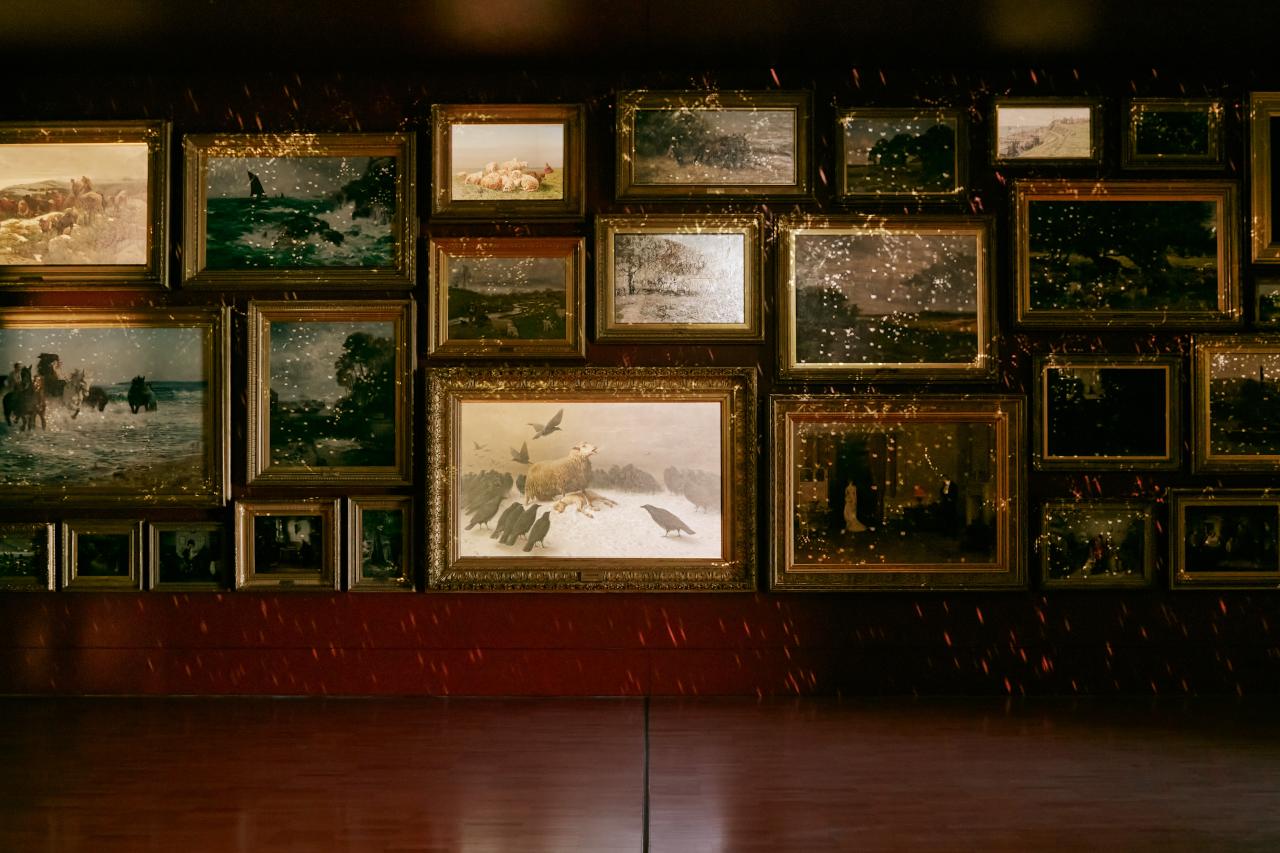
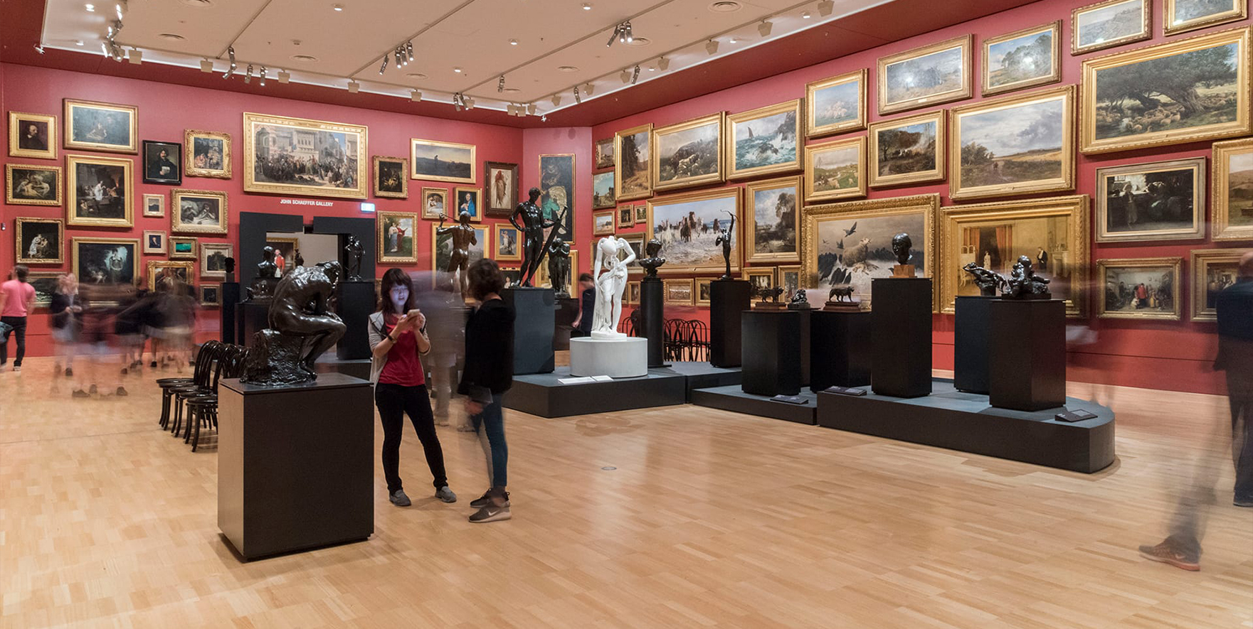
Let’s say that my enjoyment of traditional paintings puts me in with the pearl-clutching East Melbourne crowd. I’m okay with that: I really do love it. The vignettes of life in other times and the mise-en-scène hinting at what was important and ‘normal’ then fascinate me. I like the floor to ceiling expanse of heavy, gilded frames, the stories, and the fact that it’s actually fairly overwhelming but somehow that doesn’t turn it a bad experience. And honestly (how old am I?), I also like the fact I can sit down and just take it all in. 

I love the whole gallery, but time fades away for me in that room. It’s slow where we’re used to instant, snappy and fleeting. It’s quiet, but we’re so used to everything being loud. How refreshing.

“It’s slow where we’re used to instant, snappy and fleeting. It’s quiet, but we’re so used to everything being loud.”

There are a few paintings that I always gravitate to. And while I actively try to learn more about some of the other pieces, they’re always there at the edge of my vision, calling for my attention.

The first is The First Cloud by William Quiller Orchardson, painted in 1887: a portrait of a wealthy couple in a grand room. The woman is leaving the space (I imagine hearing the swish of her dress) and her much older husband stands on the rug by an empty hearth, hands in pocket, watching her go. I like to imagine she’s not putting up with whatever was said or done during the night. Where she is decisive and calm, he looks angry, a bit lost; a bit sad. 

Senior Curator Ted Gott described it as “the first cloud in the storm that is about to engulf their marriage.” I look at it and wonder what kinds of arguments were flung around that room—it could have been about a badly cooked potato or an overly salty dish, for all we know. 

Then there is Anguish. You’d know it: the cold, depressing one with the grieving sheep protecting its dying lamb, surrounded by a murder of crows (has there ever been a more appropriate collective noun?). 

Mumma sheep looks so distressed, you can feel her sorrow. They’re really just opportunistically waiting for a moment of weakness—I wonder how much longer she has in her. I read somewhere recently that the artist, August Schenck, is ‘metaphorically examining a broader human condition in the context of an animal painting.’ There’s still an impossible number of ways to read into that.

Both of them old, with themes still relevant today.

I try to pick apart how the curators figured which paintings to hang next to each other. Because quite clearly, one story influences the next. When does the combination of two different pieces create a new context, and when does it become jarring? And what happens when you add a whole new layer on top?

I think that’s one of the things that’s so incredible about what they’ve done with the room for the Triennial. 

Aside from the fact that I’m excited to see the two paintings next to each other, the context for the entire room has been flipped on its head. Old meets new—and how.

The NGV team has turned it into an audiovisual feast, and every single painting in the room has been made a part of a larger, newer and in some ways, more modern (yet perfectly timeless) story.

NGV Triennial 2020 installation view of 'Salon et Lumière'. Photo: Tom Ross, NGV

I’ve gone back to Salon et Lumière a bunch of times now. I’ve told my friends about it. And I’ve watched group after group of strangers who normally might glance at a painting or two and keep walking be transfixed by what the NGV has done with the room. They’re not just staying for one cycle, they want to experience it again. They turn around and watch the other side of the room or, as one person did, try and follow the lights by pirouetting on the spot—in that same old sleepy space. 

It’s pretty incredible what a darkened room with movement, lights, projections and sound can do. The old has become new again. The traditional feels relevant and the familiar is now engaging. It’s a lesson in the fact that old isn’t necessarily irrelevant, it just might benefit from a new context; a different spin. Not an easy task in a world that’s constantly shouting for the latest, newest, coolest thing… 

Especially when there’s a Koons just around another corner.