COULD AUSSIES FEEL AS STRONGLY ABOUT ANTARCTICA AS THEIR OWN BACKYARD OR BALCONY?
SAEF: Brand and website
SAEF highlights crucial work to be done in the region, art direction for the brand helps with this.
Today the polar regions are warming faster than any other place on the planet. They are the canary in the coalmine for the climate emergency. SAEF is pioneering science and work in new regions of Antarctica to better understand how our planet is responding to climate change and how to address it.
A contextual logo suite and icons for all applications were delivered.
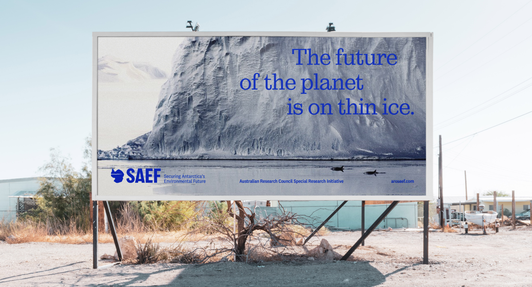
Our future is on thin ice
The week we completed our first piece of work with SAEF an ice shelf as large as Rome collapsed in East Antarctica. Temperatures up to 40 degrees fahrenheit higher than normal hastened this. It was a telling reminder that the time to act is now and that science alone will not change our path.
As SAEF CEO Steven Chown explained: ‘the science will be excellent, but we need people in the outback to care.’
“We need to win over the farmer in outback South Australia. Don’t worry about the science; that will be excellent.”
— Steven Chown, CEO
Truth to power
The organisational name was locked in along with funding from the Australian Research Council but how best to bring this mission to life for all Australians? For many research organisations it’s easy to fall into the trap of preaching to the choir. There is a lot of well-founded and persuasive material to flex on. In the case of SAEF though, the end client is the Australian taxpayer. If all of us are not enriched and better informed we are poorer for it. We needed to find a branding strategy that would bring everybody with SAEF, if not onto the ice itself.
In a first for us, we outlined a combination of two common brand tropes to find a new way to speak on complex, sometimes intimidating themes: as a ‘Visionary’. This allows the brand to speak with clarity and without flinching – for those who understand and agree and those that need convincing.
A picture paints a thousand words. SAEF is now showing AND telling.
Brand language is punchy and informed by science, not dripping with it.
“The design really responds to our desire to represent ourselves as a research organisation, but one that invites the general public to stick around. Thank you for your work!”
— Anna Quinn, Senior Communications Adviser, SAEF
49 shades of grey
At first glance, there’s a lot of white and grey on the frozen continent, but as you look deeper the personality and nuance start to appear.
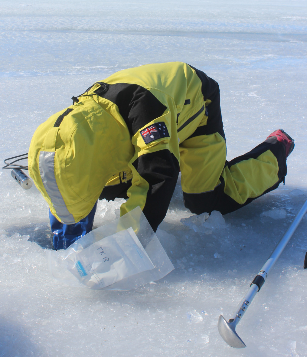
To find the colours, shapes and inspiration for fonts and art direction for the brand we drilled down into the photos, reports and science already present in the new organisation. Some of the team have been visiting Antarctica for decades and had a lot to share already.
Colours were drawn from the people, materials and machinery while shapes for brand devices and fonts came from the way nature weathers the continent and how we influence it with our presence.
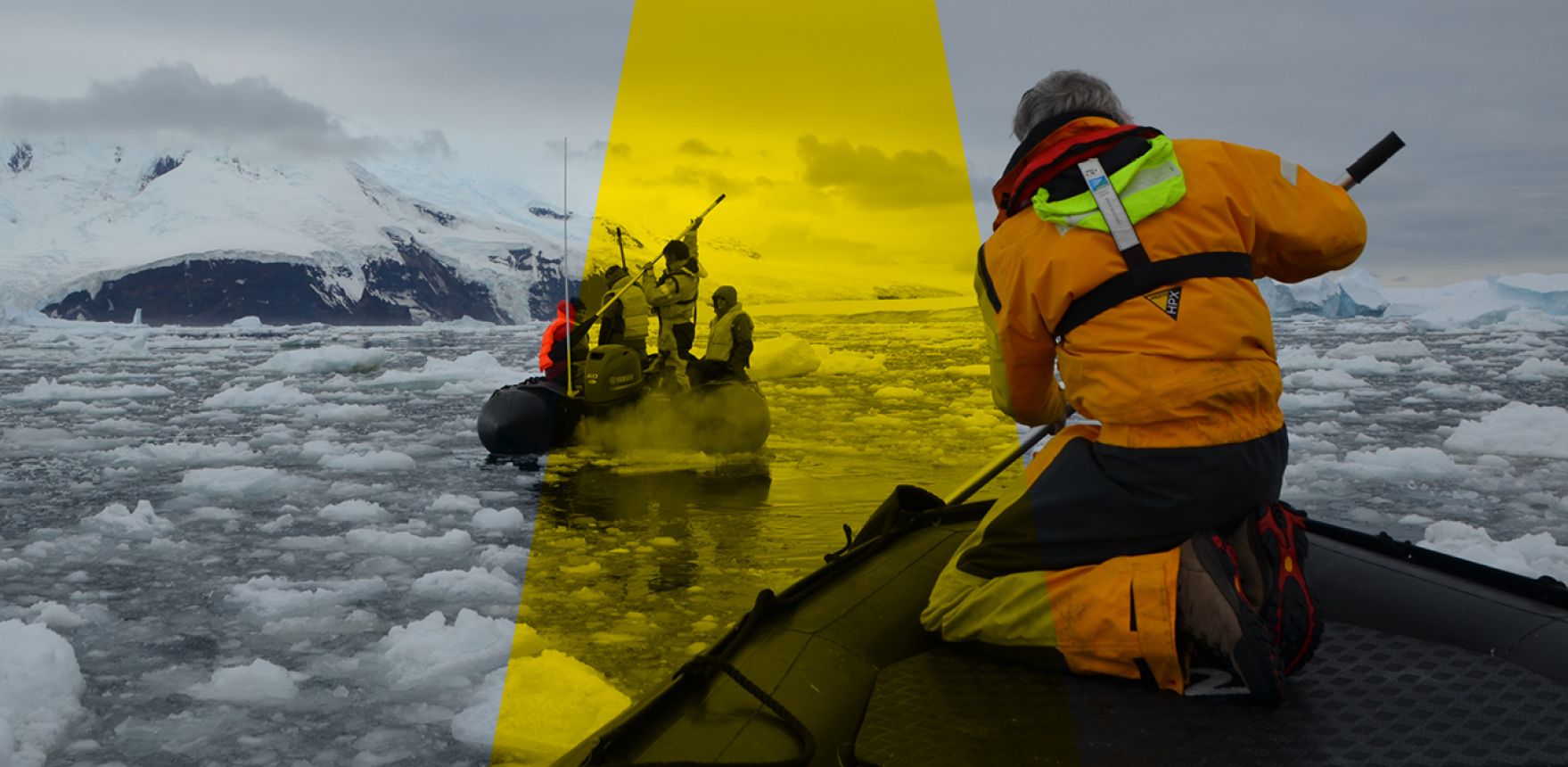
The frozen landscape, with enough ice to raise sea levels 50ft, also inspired our art direction but people were the key there and hold the eye best.
Colour was drawn from the people, materials and machinery of Antarctica.
A home for the work and stories
We have three aims for the SAEF website: to show the science in an accessible and accurate way, to bridge the gap between scientists and the rest of us and to be a resource for anyone, even a young child, to lean on.
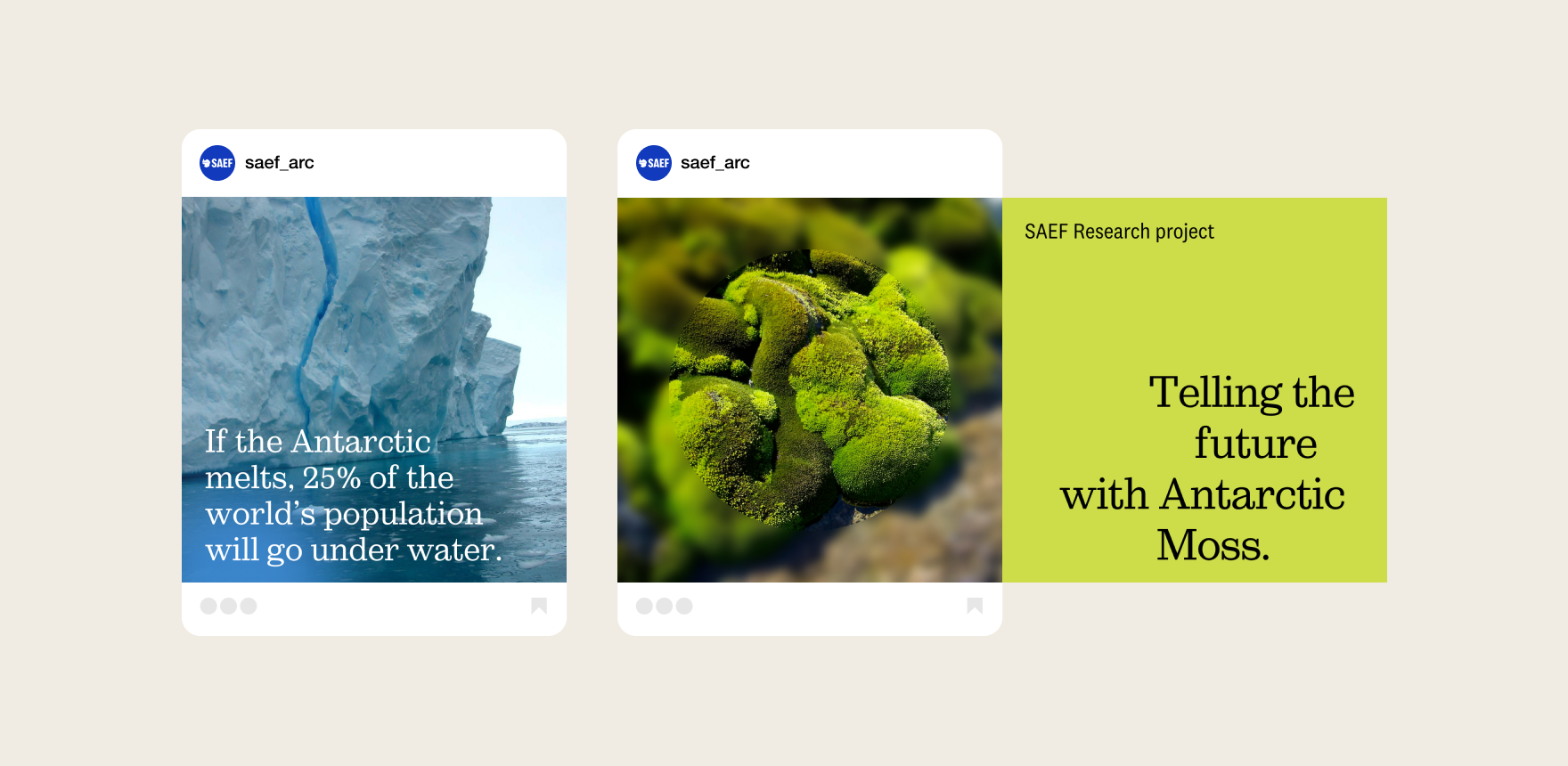
For the second aim, we decided on a less conventional landing page experience and tell a story from the first pixel to the end of the first scroll of the site. The stunning imagery and video from Antarctica led us on this.
Text page design provides simple explainers and easy scanning for content that can be necessarily dense at times. The creation of resources as simple as coloring in sheets means SAEF will be winning over Australians as young as four years old.
“We must show that through our science, we’re securing a better future for our planet, not just for Antarctica.”
– Steven Chown, CEO, SAEF
“This makes me really proud to work at SAEF.”
— Staff member, SAEF
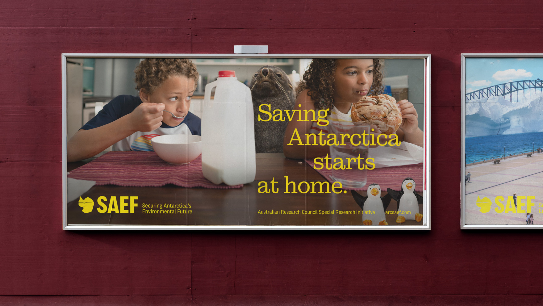
Showing pieces of Antarctica in everyday settings for Australians shows Antarctica is closer than we think.
Skills, people and details
Warren Davies
Project Manager, Senior Strategist
Amber Goedegebuure
Design Director
Sinead Roarty
Senior Copywriter
Rachel Chiat
Copywriter
Owen Davey
Senior Developer
Services
Brand, Creative, Website
SDGs
Climate Action (#13), Life Below Water (#14), Life On Land (#15)
More projects like this one
Zoe Daniel, Independent Electoral platform and website »
Sustainable Floristry Network Brand and Service Design »