HOW CAN WE ENCOURAGE EVERYBODY TO WALK WITH FIRST AUSTRALIANS?
Children’s Ground: Website and Brand Language
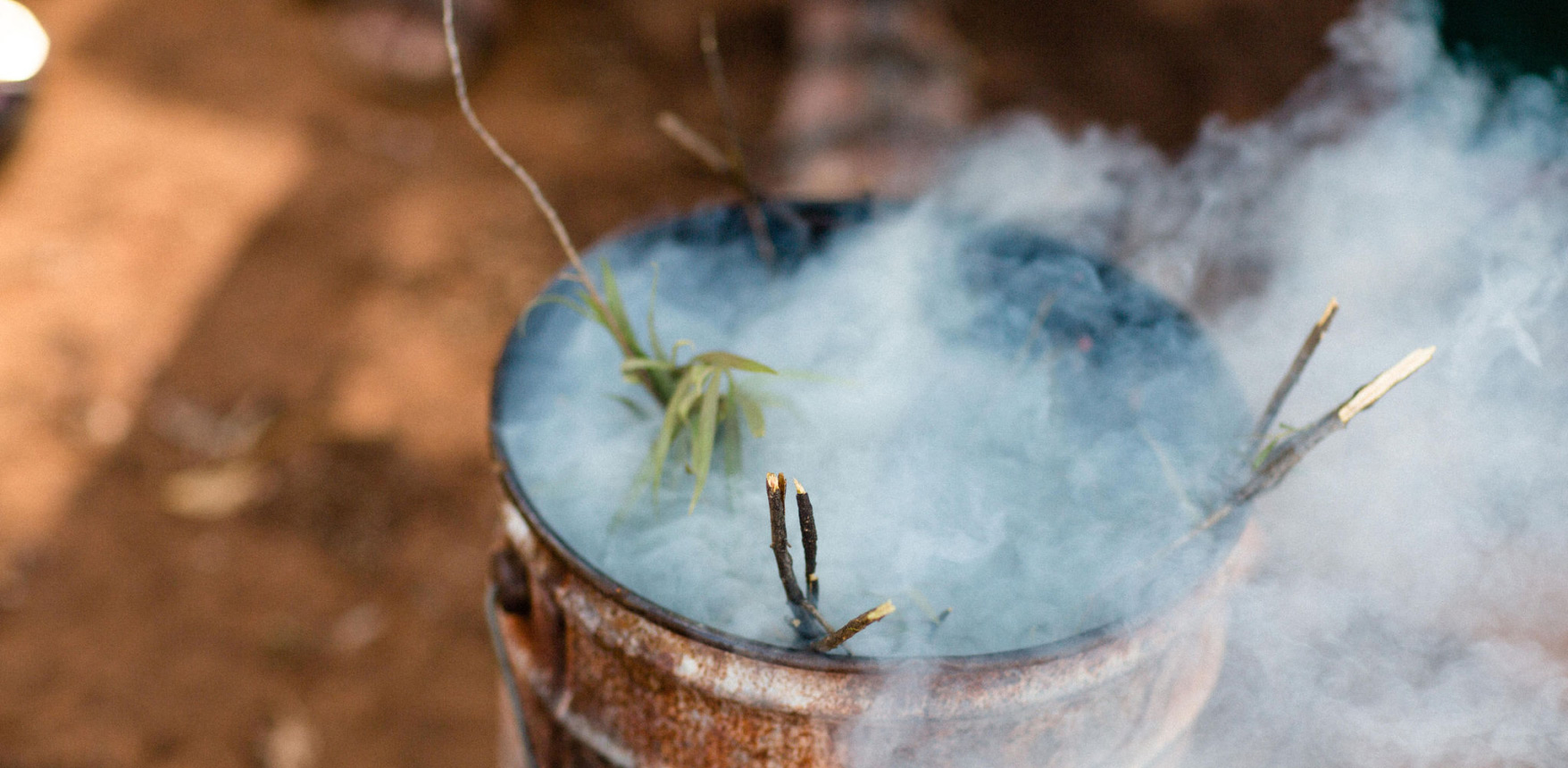
Communicating life on country takes time.
The 2022 Closing the Gap report by the office of The Prime Minister found the gulf between First Nations people and the rest of Australia is still widening. Could a grassroots organisation help swing the momentum the other way?
Hear our stories
In mid’ 2022 the community at Children’s Ground knew they were ready for change. How they told their story online needed to reflect how they spoke to each other and to everyone they worked with. To date written communication and digital media had been formal, careful and in line with what they thought people wanted to hear.
Early work in the website and brand language project by All or Nothing saw us sitting down with communities to hear their stories first-hand, understand how they were relayed and published and note down needs from staff and volunteers.
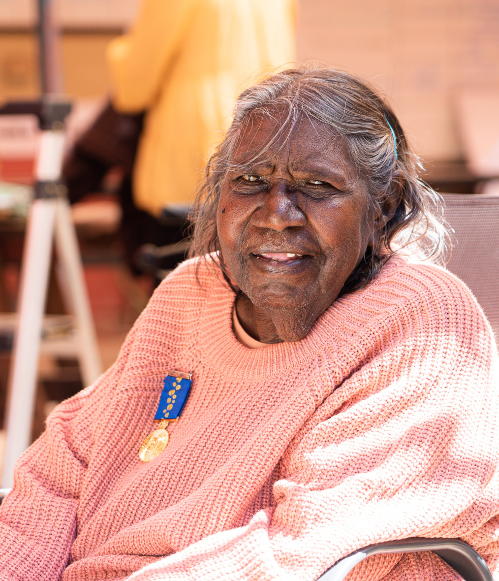
The community IS the organisation, stories needed to reflect this.
“Language is who we are, it means something to us. It’s our identity.”
— Victoria May, Children’s Ground
Say it loud
Following a round of discovery sessions with their wider community we set about creating an organisational tone of voice with Children’s Ground that was both easy to work with (natural, repeatable, easy to follow) and authentic. There are many languages across the organisation so as well as working with English we encouraged development of parallel documentation in other languages.
A language mode can be readily repeated once a team understands how it works and the soft guardrails to follow. Language needs to be one of the most robust and flexible elements of a brand to be effective across a distributed team with varied experience in branding. Where the clash of languages has been in place for 200+ years it will take some months to get used to new words and form. But as we repeated – learning is everywhere!
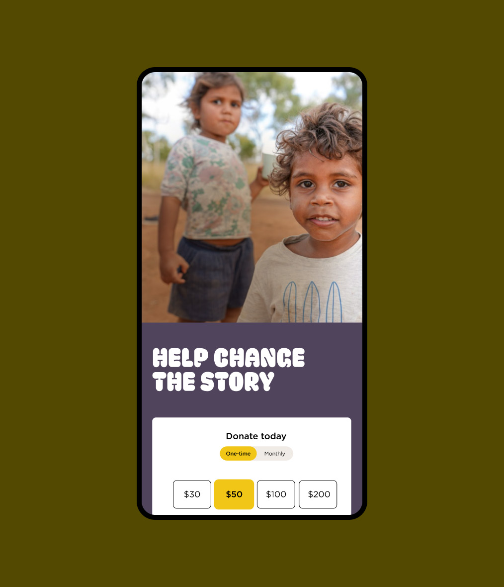
The mobile site
Multi-language brand development took place.
Connect first, ask later
The organisation does rely on fundraising and merchandise sales to fund programs and so a sensitive approach to these website functions was needed. The existing site used current practice to ask early and clearly for opt-ins and contributions from site visitors. We were keen to keep this focus but interested to see what ways we could bring forward the narrative for the organisation, natural ways to interact with the activities and outcomes for program work and campaigns and, put people first.
Data and conversations suggested it would be possible to bring forward the stories from successful projects, voices of young people in video, narrative and photography and also the wisdom and fire (!) of the elders. The ‘Why’ was down-weighted in the information architecture (still easy to find) but we felt the evidence was clear when people could see and hear it for themselves.
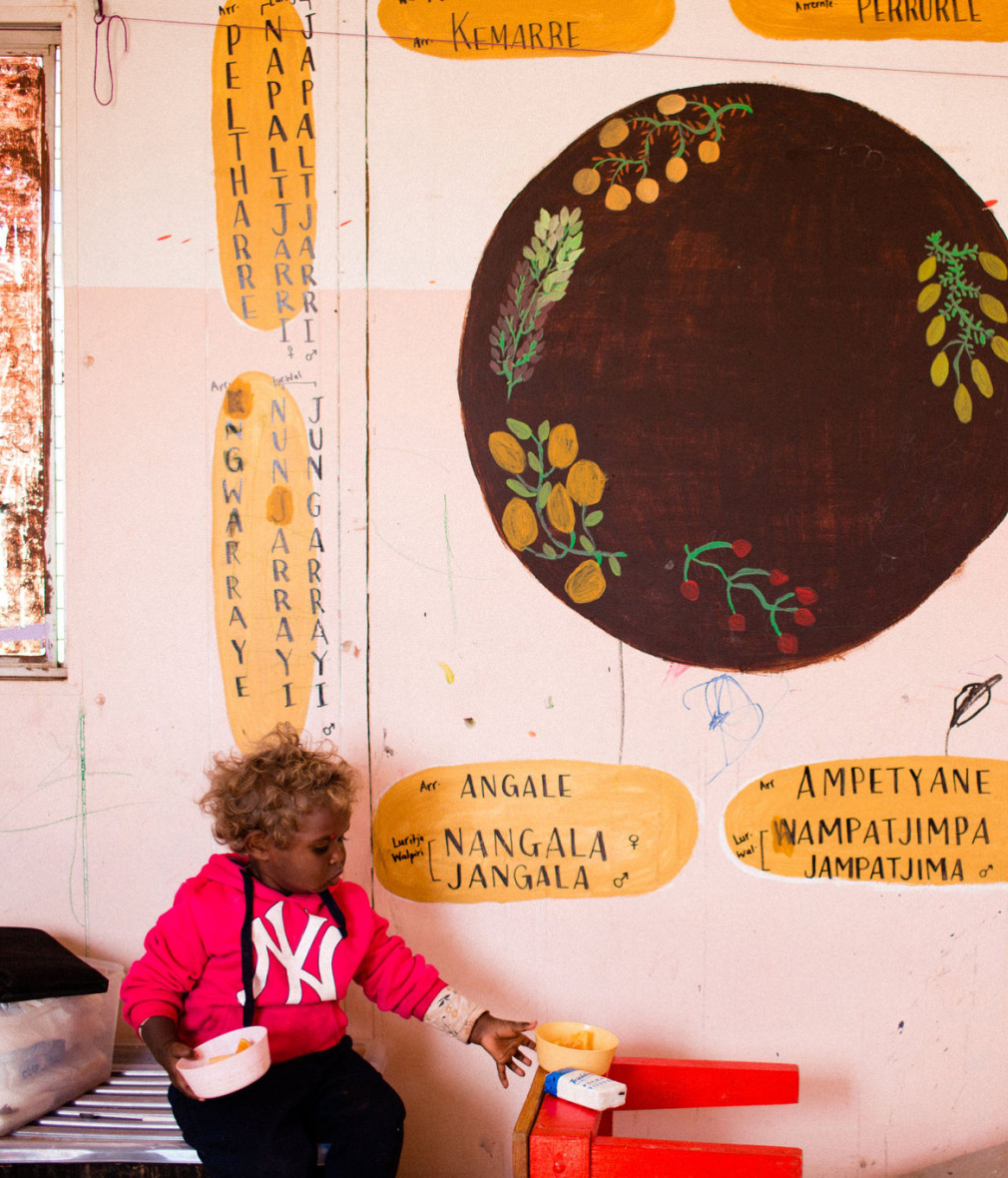
Children’s Ground has a youth-led focus.
“One future, one journey, one mob.”
— Larrakia country elder
Designing for rich content
With a lead on brand language we then shifted our attention to website design and content creation. The old website was information-dense, structured for the organisation rather than the site user and had a focus on transactional features, much of it starting to show age (hello CDs).
A flexible grid, strong information and type heirarchy and bringing content to the front now works with a better understanding of what site users look for today. Through an assessment of google analytics, Hotjar sessions and refresh of their site user personas we’ve found a better balance in the site and page structure.
Page design is now simple and fluid.
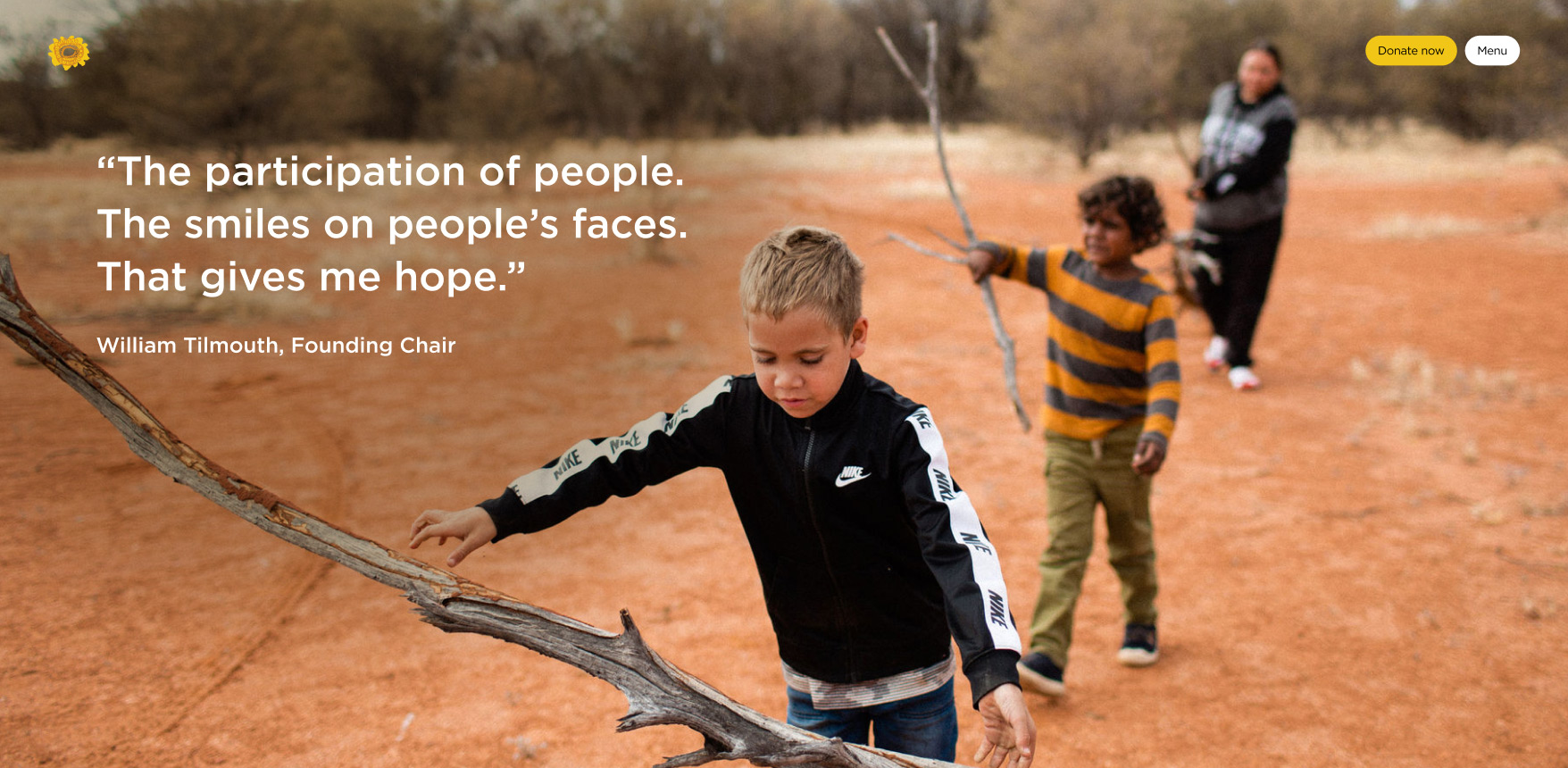
When the stories land, there is hope.
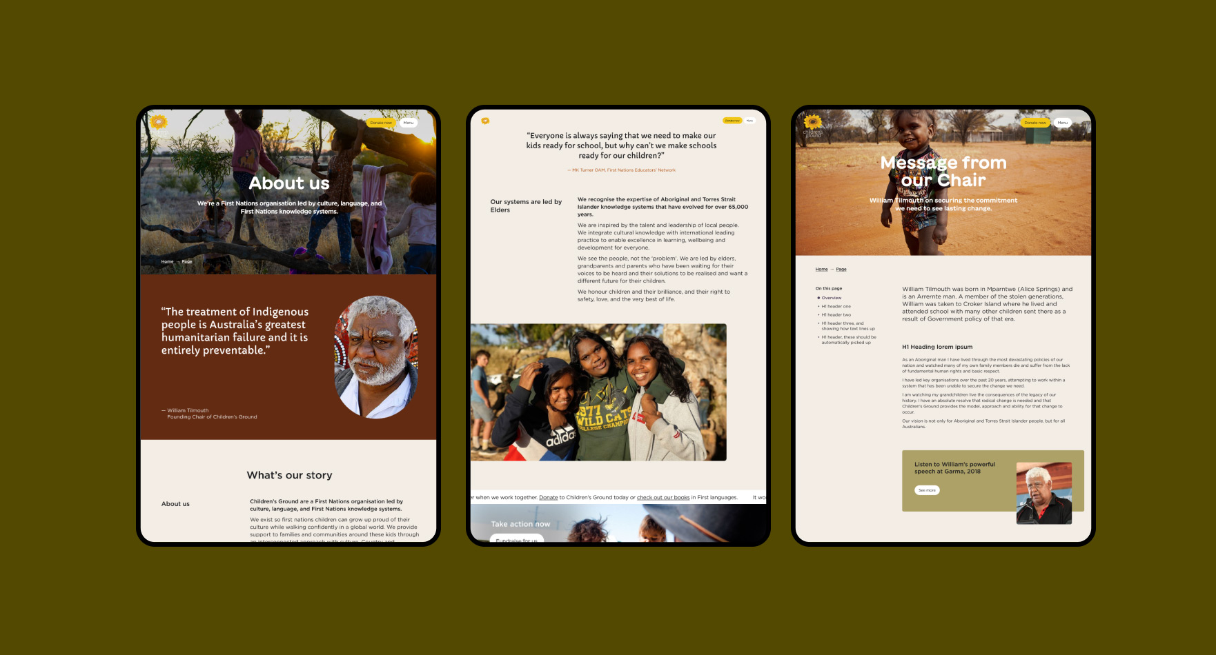
A colour scheme for the country the stories come from.
Skills, people and details
Warren Davies
Senior Strategist, Project Manager
Amber Goedegebuure
Senior Designer
Shyaire Ganglani
ACD-Copywriter
Owen Davey
Senior Developer
Services
Website creation, Brand language development
SDGs
Reduced Inequalities, Peace and Justice (#10)
Sustainable cities and communities (#11)
More projects like this one
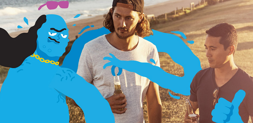
VicHealth Strategy and Creative »
Sustainable Floristry Network Brand and Service Design »