REDUCING THE LATENCY IN MEDICAL KNOWLEDGE FROM YEARS TO WEEKS.
MedLitGo: Strategy, Branding, UI Design
There are few more urgent cases for getting the right information to the right people.
It’s comforting to think when you visit your GP or specialist that they are working with the latest knowledge relative to your complaint. Often it’s not the case. Most doctors see 10-15 years of education with established knowledge central to that. Add another five years or so of training on the job with established doctors and knowledge on a particular topic can easily be twenty years or more old.
MedLitGo is dramatically reducing the latency between medical discovery and application with it’s platform for doctors in 2020.
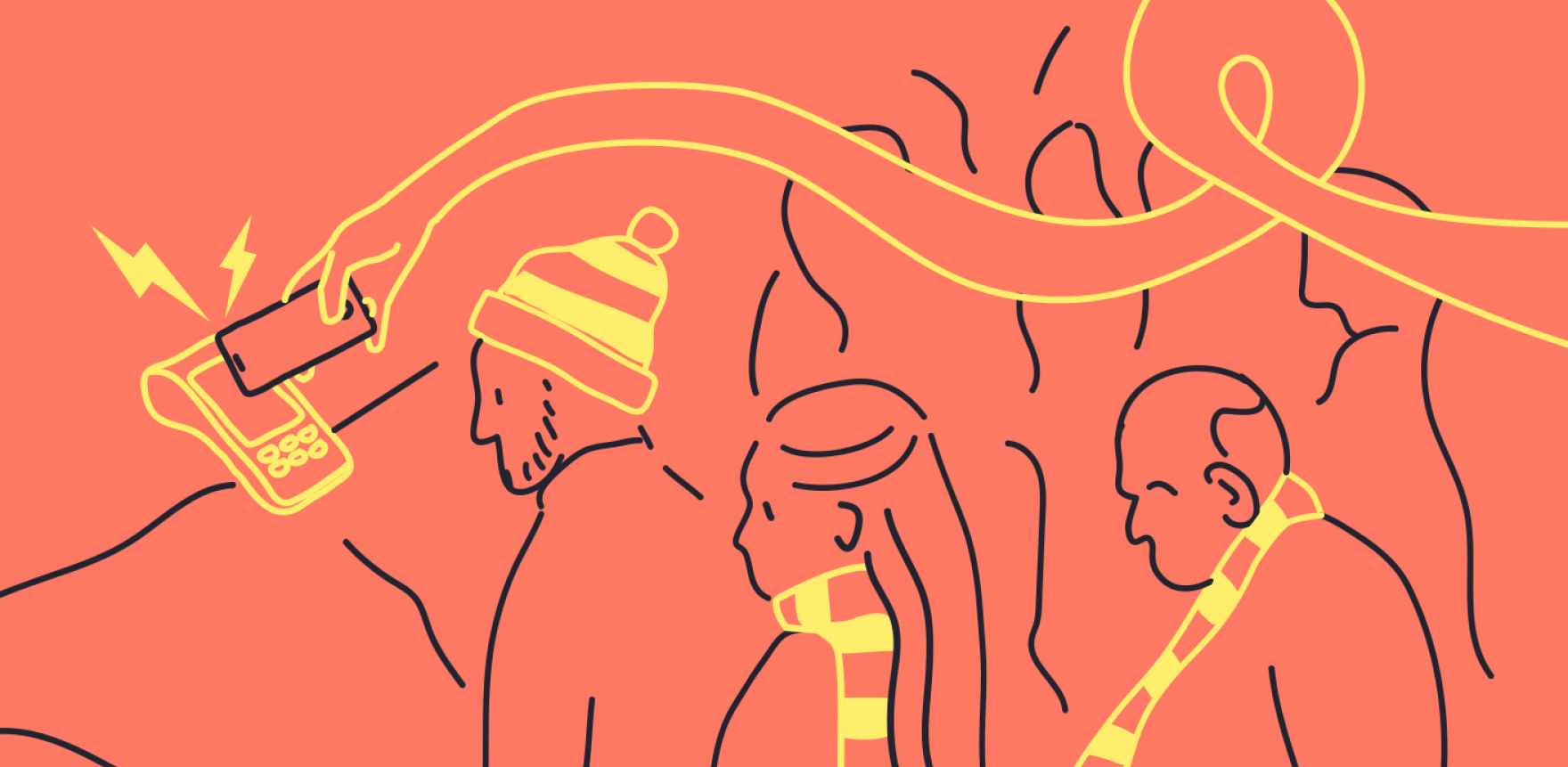
The struggle to keep up
All specialist doctors and many GPs follow specific diseases and conditions with interest and will know who the experts and exciting researchers are in their field. To date it’s been challenging to follow current and recent research and engage with others for the benefit of all. What’s more, the forums for learning and debate are owned by publishing interests and associations.
All or Nothing were charged with picking up work to date and creating a distinctive platform for the thriving forum the MedLitGo team imagines.
Copy is warm and conversational, avoiding technical language where possible.
“Doctors just don’t have the time or inclination to track down books and journals or obscure websites for the latest research. It has to be easier than that.”
— Joseph Ischia, MedLitGo
Creating a sticky service
Joseph and Cyril were keen that the brand and platform needed to be for someone happy to read deeply and take part. It was not be a lightweight social media platform for GPs.
With some wider conversations among the project team we began to sense what might be a part of creating a ‘stickier’ service with connections among peers at the heart of it.
A simple device to show notifications.
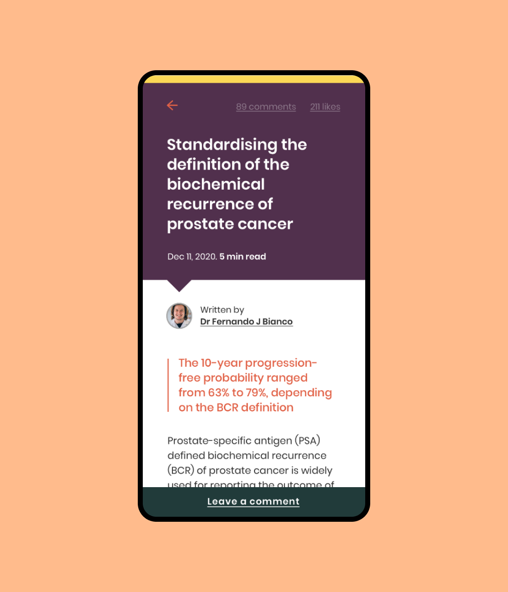
It’s the knowledge, not the journey
For the first stage of design and content development we have worked on simplifying the user experience for what could be quite a deep dive into diseases. The previous concept for the ‘disease journey’ worked with tabs and concertina menus – great for showing more but, ultimately the information density can be too much.
We’ve followed a more playful navigation favoured by thumbs, lonely hearts and music buffs.User testing saw dozens of people quickly finding their way through with high accuracy.
“I can see how my articles are going…
I can see my mentions…
I can see people in my area of expertise…
Nice summary.”
— Feedback, user testing
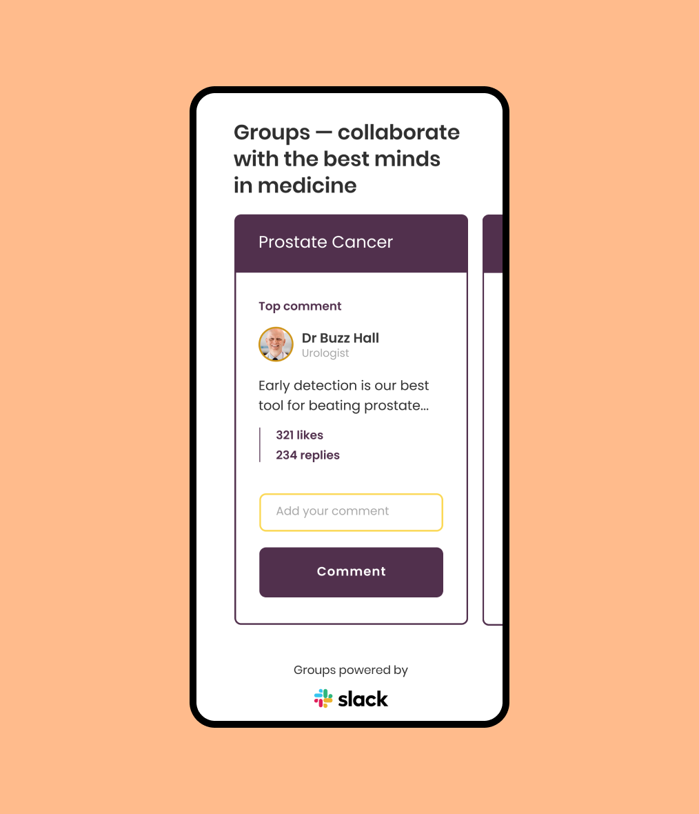
Starting conversations
It’s rare outside of internal email or in person conversations for doctors to be able to discuss research and new discoveries with people in their field.
We’ve grown the idea of groups for MedLitGo to be a singular focus for joining, less so a nice feature down the track. The sign up process encourages people to join a group most relevant to them and to comment on a thread by a user likely to be of interest to them as well.
Return visitors can see what they’ve missed relative to their activity and super users are given a suitable design treatment to encourage their early involvement.
We’re excited for the next stage in 2021.
The social space where users can get together to share and discuss ideas on any number of topics.
Updated colours and typefaces
Skills, people and details
Ash Reynolds
Designer & Art Director
Luke Falkland-Brown
Senior Copywriter
Warren Davies
Senior Strategist
Amber Goedegebuure
Design Director
Services
Branding, UI Design, Copywriting, Product development
SDGs
Ensure healthy lives and promote well-being for all at all ages (#3)
More projects like this one

Raspberry Ripple Brand and Website »