COULD EVERY HOUSE FEEL LIKE A HOME – WHETHER YOU RENT OR OWN?
Tenants Victoria: Service Design and Website
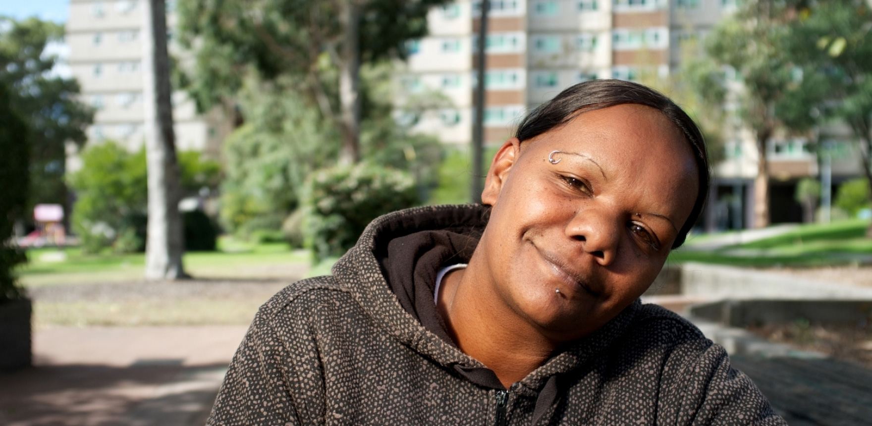
Art direction involved photography and illustration.
Having a roof over your head is a basic human need, one the folks at Tenants Victoria fight tirelessly for. But with a confusing and cluttered website driving too many people towards their overworked legal team, we needed to design an online experience that gave tenants everything they needed to protect their rights.
What could a service be in 2020?
Every day Victorian renters are faced with eviction, disputes with others and challenging circumstances at home. Tenants Victoria has been a resource and place of advice, support and a cup of tea since the 1970s. Service user behaviour and the service itself has changed steadily over the past decade. In 2020 it was time for a re-think on how services are delivered through the website and the methods of the organisation itself.
Mobile use has increased steadily over the past five years.
“When I realised there were over 1,000 pages I almost fell off my chair!”
— Ash, All or Nothing
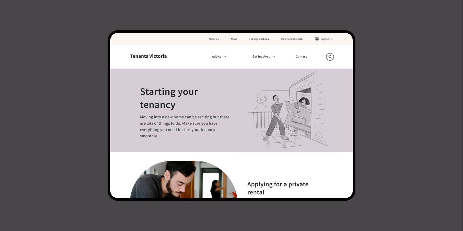
Advice pages on the website were condensed to suit common use today.
Doing more with less
The Tenants Victoria website, email and phone service are the frontline for service delivery and the renter’s experience with the organisation. Like many community legal centres it has been asked to do more with less in recent years and while interest and resources were there, the service interface was groaning under the weight of them. All or Nothing was asked to look at what service means for the organisation in 2020 and beyond and how to deliver this through the website with users and partners.
What would you like in a service?
We created a project organisation with its own identity and intentional culture drawn from the agency and Tenants Victoria and began interviewing Victorian renters. We were interested in the context for seeking help, how they go about it and what ideas they had for making it better for them. We heard that lawyers and staff were knowledgeable and helpful but technology and resourcing sometimes let them down. Even the most challenged user was keen to self-service within reason if we could design for that. Some further time following the work habits and needs of the service team and lawyers and we had a place to start from.
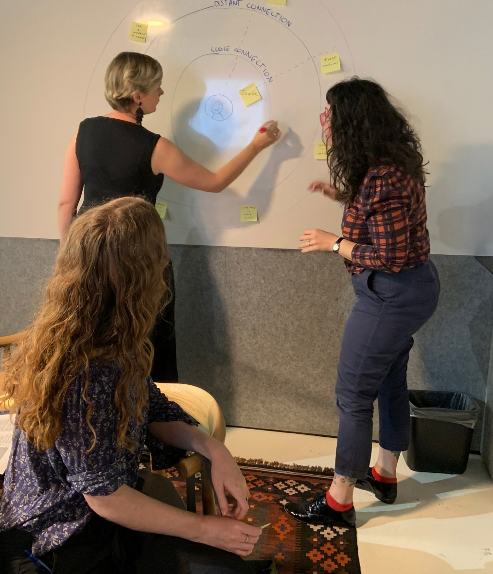
Service design workshop with the ‘Website Eviction Team’.
“The help seeker is changing and we need to change with them. People want help without a song and dance about it.”
— Farah Farouque, Director of Engagement
A site in 25 languages
The previous website platform for the organisation numbered over a thousand pages in twenty-five languages. It contained resources dating back decades and team members committed to existing process and technology. The intent to deliver services with more empathy was there but translating this into design, content and technology was by no means easy. If this was in doubt, COVID-19 and an extensive lockdown in Melbourne saw to that. The client team showed more than their fair share of grit, and across content auditing and development, brand design, UX and UI design we were able to address most issues and opportunities within the scope.
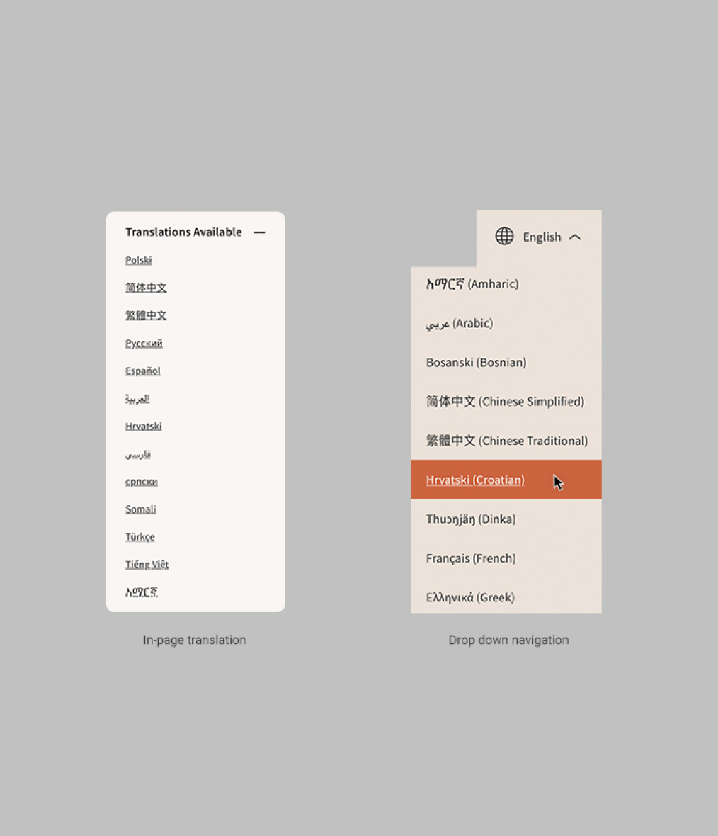
Thousands of people from dozens of ethnic communities use the site each month.
Change is here
This project is just the start of a design and digital transformation for the organisation with works in the wings set to appear in 2021 and beyond. The tens of thousands of monthly users are already finding the service more direct, helpful in a shorter space of time and easier to navigate. When a crisis arises, help is easy to find. And when simple research is needed it’s clear that’s the case for most people. In a difficult year for many organisations, Tenants Victoria has made life easier for millions of Victorians.

Renting should not mean a lack of security or support for Victorians.
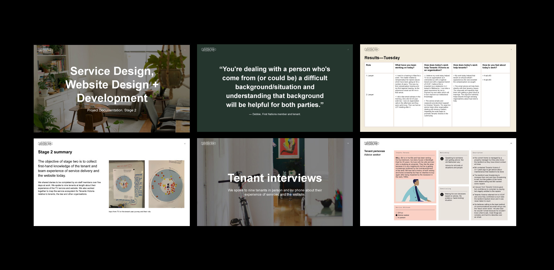
Understanding the user’s needs put empathy at the centre of the solution.
Skills, people and details
Ash Reynolds
Designer and Art Director
Luke Falkland-Brown
Senior Copywriter
Amber Goedegebuure
Associate Design Director
Warren Davies
Project Manager, Senior Strategist
Owen Davey
Tech Lead and Senior Developer
Jeffrey Phillips
Illustrator
Services
Service Design, Strategy, Art Direction, Graphic Design, UX Design, UI Design, Copywriting, Illustration, Digital Development, SEO
SDGs
Reduced Inequalities, Peace and Justice (#10)
More projects like this one

Eating Disorders Victoria Website and Creative »
Justice Connect Website, Service Design »